Colour in Soft Furnishings: How to Mix and Match
Author: Sophie Seeger


Developing your eye for colour in cushions, chairs, curtains and more can make your home sing
Ok, so let’s define soft furnishings: for the sake of this article it’s items that are made from fabric, such as cushions, rugs, cloth lampshades, curtains, bed linen, and all chair and ottoman coverings.
Figuring out which colours match and which clash can be quite bewildering. However, simply understanding the following few basic colour principles will help you mix and match colour in your soft furnishings so that your cushions don’t want to punch the throws, the throws don’t want to punch the sofa upholstery, and you don’t feel like walking out of each room with your hands in the air in defeat…
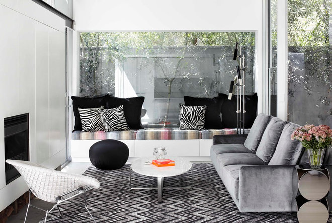
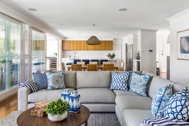
Using the same colours throughout your soft furnishings can be supermodel stunning and sophisticated; and allows you to then experiment with a variety of print designs, from the floor up.
STYLE TIP: Keep some soft furnishings in a plain colour to breathe air into the room, allowing the busier designs to stand out.
STYLE TIP: Using a variety of prints with the same background colour, will further add a pleasing harmony.
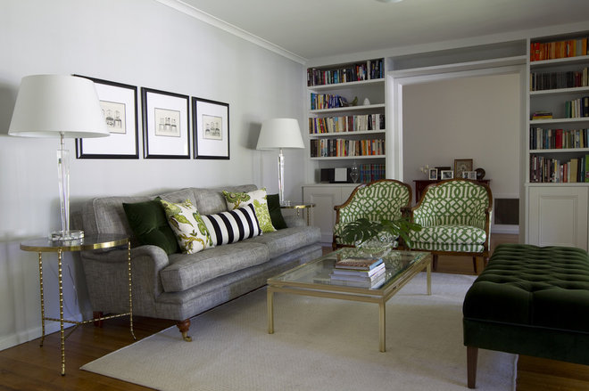
Choosing a colour that puts a smile on your face and leaves you with an inner glow is an excellent place to start. Then use that same colour across your plain upholstered pieces, your prints and your accent cushions. The overall result will be one of calm and beauty.
STYLE TIP: Don’t overdo your favourite shade. Less is more for an elegant look.
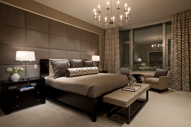
These are the colours of the earth, of sand, soil and rock. Like the earth they also come in different “temperatures”, from warm taupes to cool greys. For ease of matching, stick with neutrals of the same temperature. For a cool look, stick with bright whites and blue-blacks; and for a warm look go for taupes and creams.
STYLE TIP: Use neutrals in solid colours as the base for your walls, floors and in your upholstery. This will help neutralise large and bold prints in select soft furnishings.
These are the brothers and sisters on the colour wheel and they don’t bite. Think aqua and lime green, orange and yellow, red and purple – all of which can be used in different graduations.
STYLE TIP: Use blues and indigos together for a fresh coastal look, especially on a white background.
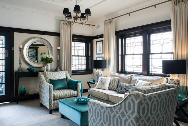
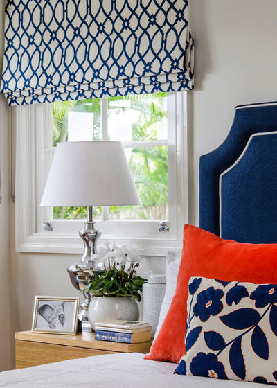
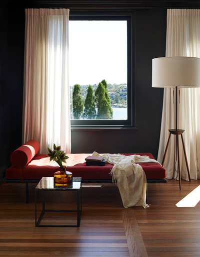
As an alternative, try colours together that sit opposite to each other on the colour wheel, such as blue and orange, red and green, and purple and yellow. When you place opposite colours next to one another they help each other stand out. Even if you add the same amount of white paint to each of the colours (to soften them), then those new tints will still work together.
STYLE TIP: Use opposing colours together in the one print, or separate them, as in the room above.
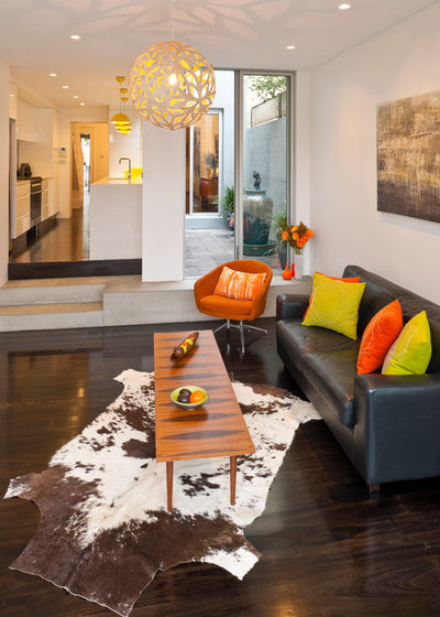
If you like the summer sun on your face and the smell of spring jonquils, then a warm colour palette will bring you joy. So tune into yellows and oranges and they’ll play beautifully with your natural timbers and floor coverings. If on the other hand, you enjoy a cool breeze and dips in the ocean, a cooler, more coastal palette, will bring you calm. Try aqua blues and minty greens…
STYLE TIP: Bring the upholstery colour of an occasional chair into the throw cushions on the main sofa for cohesion.
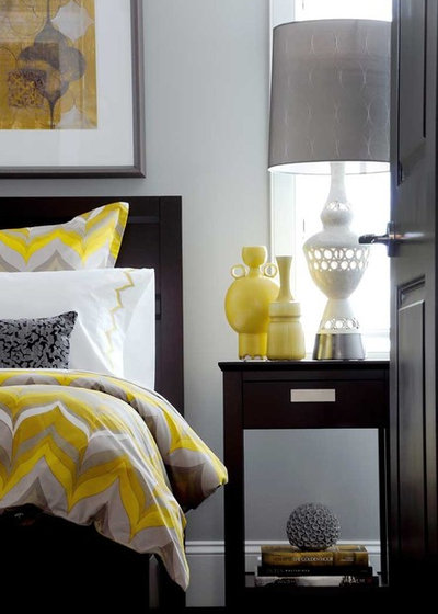
A painting or print can set the colour palette for the soft furnishings in a room. Choose a dominant colour from the artwork and use sparingly in one print or across a few.
STYLE TIP: Pick a second more neutral colour from your main soft furnishing (in this instance a soft grey in the quilt cover), and repeat that colour through the accent cushions, lampshades and picture frame to hold all of the elements together.
If you’re feeling confident with colour and you want to create a funky effect, then mix up a warm and cool palette. It might feel a bit incongruous but will keep you on your toes!
STYLE TIP: Experiment with colours until you reach a combination you love. Note that any colour can have an element of warmth or coolness. If you mix cool purple with red, the result is a warm purple; if you mix a warm purple with blue, the result is a cooler violet.
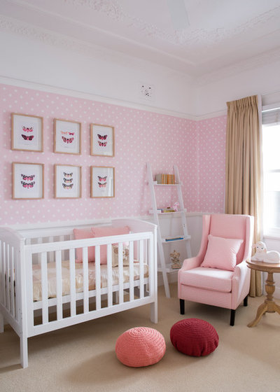
Allowing your wall colour to dictate the soft furnishing colours is a fail-safe way to create room flow. Take a paint colour swatch to a textile house and match it closely to a plain or print fabric to use in your soft furnishings.
STYLE TIP: To give the room more vibrancy, you can introduce little pops of colour within the same tonal family, as done here with the stronger pink and burgundy poufs.
HAVE YOUR SAY
What colour combinations have you used in your soft furnishings that give your home colour harmony? Let us know in the comments section.
<div id="hzroot4853394" style="width:300px;text-align:center;font-size:12px;padding:0;border:0;margin:0;"><div style="font-size:14px;margin-bottom:3px;"><a href="https://www.houzz.com.au/magazine/colour-in-soft-furnishings-how-to-mix-and-match-stsetivw-vs~33125832" target="_blank">Colour in Soft Furnishings: How to Mix and Match</a></div><div style="padding:0;margin:0;border:0;margin-bottom:3px;"><iframe data-hzvt="MjAxOTEwMzA6NDEwNDp2aWV3R2FsbGVyeQ==" name="HouzzWidget6211029" id="HouzzWidget6211029" border=0 frameborder="0" SCROLLING=NO style="border:0 none;width:300px;height:275px;" src="https://www.houzz.com.au/jsGalleryWidget/gallery/33125832//new_window=yes/title_on=yes/width=300"></iframe></div></div>


